Amber-Lit Traffic Signal
Field Notes
An Interesting Observation
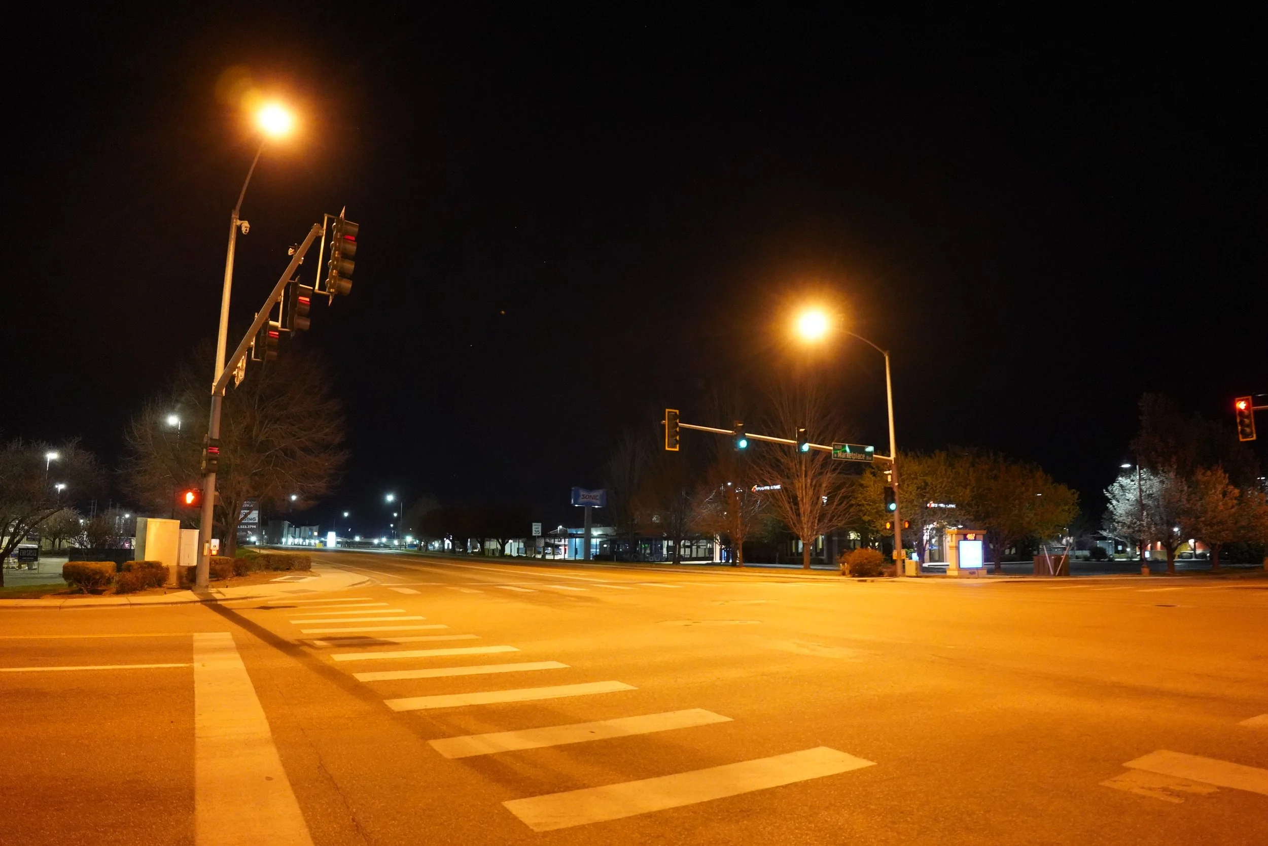
The warm amber appearance of the lighting created a comfortable nighttime environment.
The color temperature reduced harshness and helped the intersection blend into its surroundings. The overall atmosphere felt calmer than many higher-CCT roadway installations.
At the same time, the warm appearance raised an interesting question:
How do agencies balance community comfort with pedestrian visibility?
While warmer lighting can improve visual comfort and reduce perceived glare, it may also reduce contrast compared to cooler sources commonly used in transportation environments.
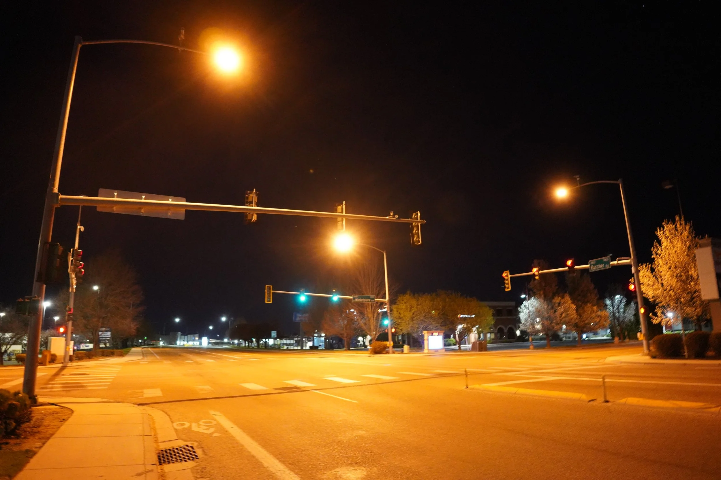
Amber-Lit traffic signal safety lighting treatment reviewing the balanced illumination and comparison to cooler lighting color temperature.
What I Observed
At first glance, the intersection appears well lit.
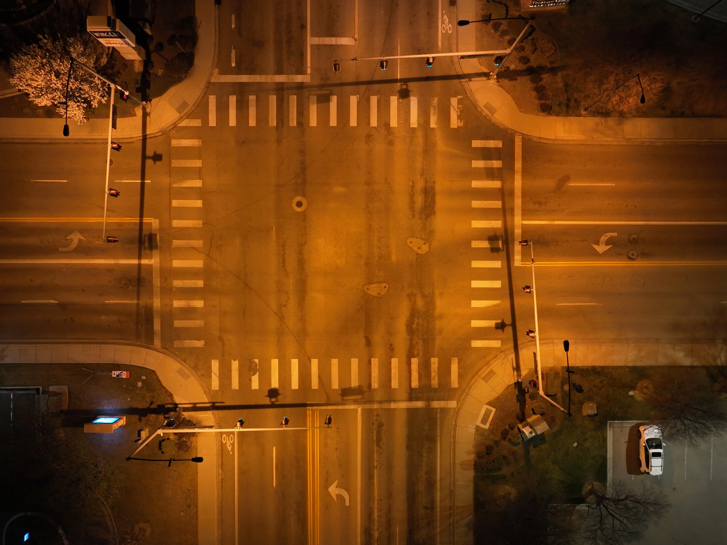
All approaches are illuminated, the roadway is clearly visible, and the crosswalks are easy to identify. Drivers would have little difficulty navigating the intersection, and pedestrians crossing within the marked crosswalks would generally be visible.
What stood out, however, was where the lighting seemed to place its emphasis, which could be a typical pitfall for signalized intersections and pedestrians.
The system appeared to work better for vehicle movement rather than pedestrian visibility, and that may be primarily due to the color of the light and traditional traffic signal area lighting placement.
Why It Matters
There is an important difference between lighting an intersection and lighting the people using it.
This location provides adequate illumination for roadway operations. Drivers can see the pavement, lane configuration, and traffic control devices without difficulty.
But when viewed through the lens of pedestrian safety, the lighting feels more passive than intentional.
Pedestrians are visible because the intersection is illuminated, not because the lighting system is specifically highlighting them.
Questions Worth Exploring
At signalized intersections, how can we balanced "adequately lit" and "pedestrian-focused" priorities?
Should Agencies focus on cooler temperatures at critical intersections for better pedestrian recognition?
How should agencies balance visual comfort, glare control, and pedestrian recognition?
Are pedestrians in crosswalks receiving the same lighting design attention as vehicle travel lanes with the traditional “area lighting” design?
Key Takeaway
This intersection performs well from a roadway lighting perspective, but it highlights a broader conversation occurring throughout the transportation industry.
Providing illumination is not necessarily the same as providing pedestrian-focused illumination. This intersection sparks a thought about color temperature; that it also matters to visibility and recognition.